A Brand Voice
Dani Strong
Brand STRATEGY, BRAND STYLING, LOGO, CUSTOM ART, PACKAGING
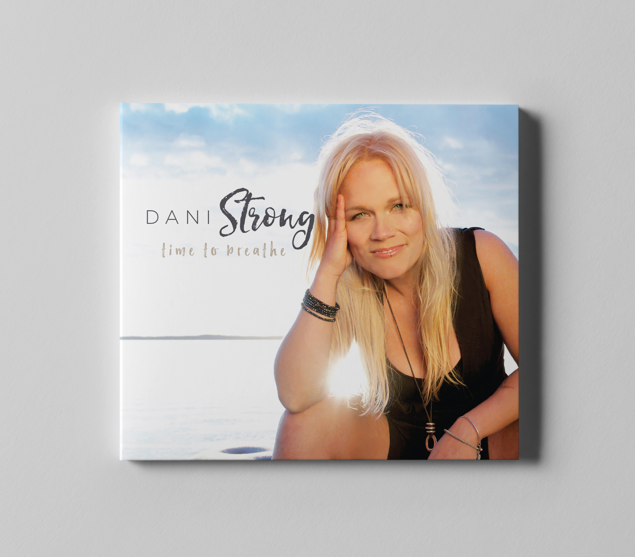
When we started working with Dani Strong, she was a dynamic, yet unknown Canadian Country artist with a huge stage presence and strong songwriting skills.
We helped build the language and visuals around her image, and were commissioned to create the album art of her debut release, which we are proud to say went straight to #1 on the country charts and #2 over all genres at iTunes!

Brand ESSENce & POSITIONING
The Dani Strong brand is built around the idea of capturing light, showing strength, and unearthing a uniquely Canadian vibe.
The imagery captures the essence and feel of the brand to highlight the energy and excitement Dani and her band exude onstage. The brand essence is based upon these words and is represented in all aspects of brand presentation visually, written and spoken:
LIght | Fiery | Focused | Authentic | Earthy | Canadian | Inviting | Warm | Strong | Energetic


THE OUTCOME
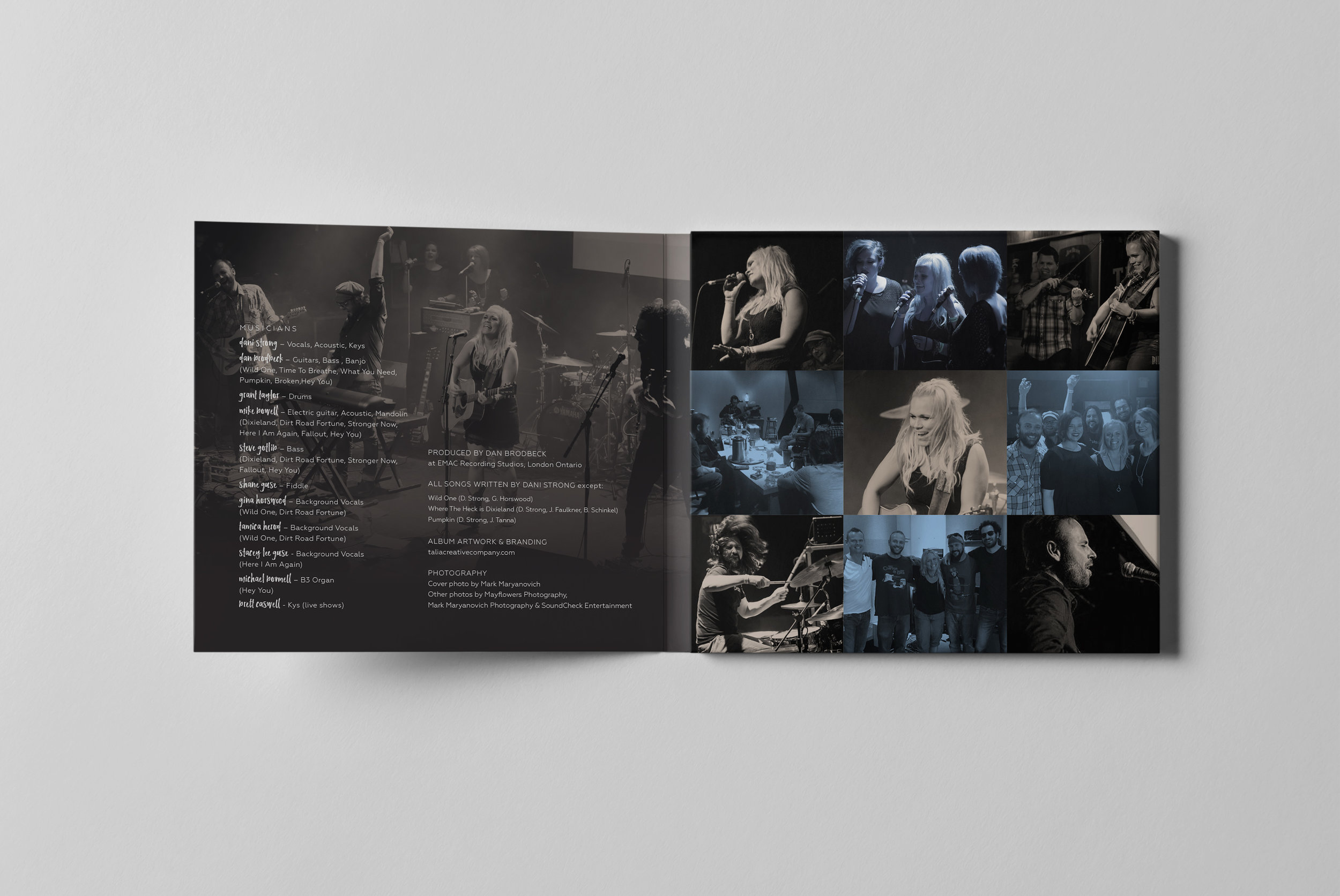
Dani is blazing her trail as an independent artist in both Canada and south of the border as well. Not only is Dani an exceptional songwriter, but she is also a captivating performer with incredible depth and charm. Feeding off of her audience she can win over any room with her brilliant wit and clever humour or simply dominate the stage with an absolutely haunting execution of one of her emotional pieces. We created the brand to match her presence.
Client SATISFACTION
“It feels quite lovely to show ‘the industry’ that you do not need a record label backing you to ‘make some noise!’ Thanks again! You went over and above for me and I’m beyond happy with my brand.”